
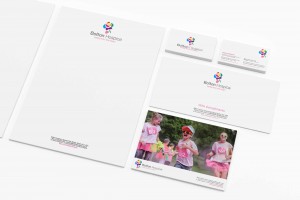
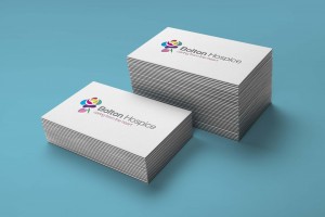


Much More Than a Logo
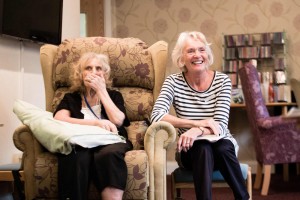
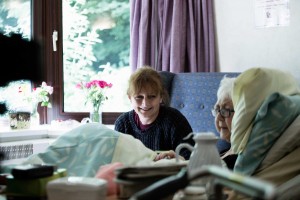
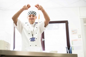
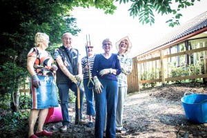
After meeting the staff and volunteers of Bolton Hospice and on a second visit, their patients and families, it became clear that the Hospice’s current logo and branding did not reflect the colorful characters inside. For starters everything was pink and our thoughts quickly turned to females and breast cancer.
It just goes to show that if your brand doesn’t reflect what it is that you're doing then it can do more harm than good. Yeah sure, we can provide you with the perfect photography and the slickest looking website, but what’s the point if your brand and logo are not singing? Now the Hospice have a logo that will stand the test of time, a brand that will help capture the hearts of hundreds and a creative office full of friends for life.