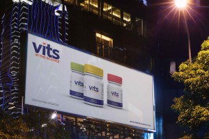
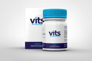
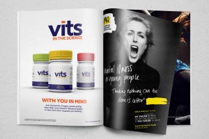
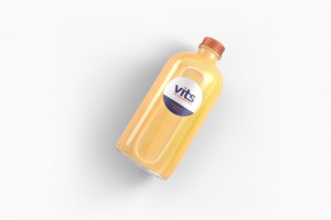
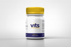
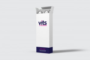
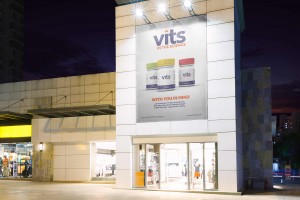
In a hugely saturated market, a unique name is very hard to come by. Most clever ideas and creative twists have been done, but one seems to have been overlooked. Vits has taken the highest quality ingredients and using the top scientific backing have created a range of products fresh to the market that are second to none. What’s so different about Vits? Well, vits all in the science. Using a lower case font the logo sits appealing and friendly, making it open and accessible for its diverse target market. Using bold bright colours again adds to the engaging nature of logo whilst ensuring that all products will stand off the shelf and catch the eye of potential customers. Widening the superscript dot on top of the ‘I’ gives it the appearance of a cap sitting nicely over the bottles, replicating the brand packaging.


SHARE
Do You Need Help Driving Your Business Forward?
Then Tim Marner® is here to help. Re-energise and propel your business forward by filling out the form below. Why? Because if you're standing still, you might as well be going backwards!
Need Our Help? Just get in touch today!
Wether it's branding, photography or even a cool website, we can help you make an impact.
�������������
