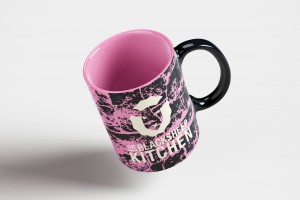
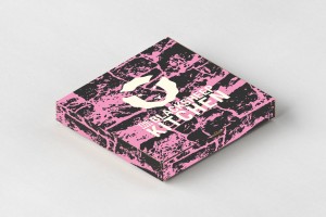
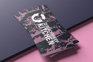
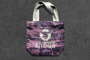
Shabby Sheep
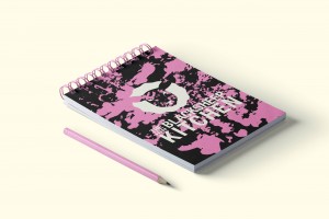
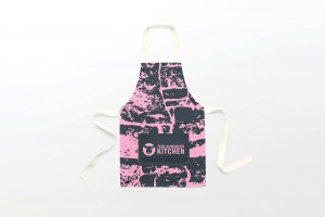
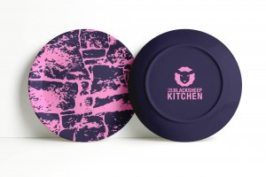
As we created the brand we started to think about textures, with being quite a craft homely brand we started looking at textures you might see at a farm or in a sheep pen. We took dry stonewalls and linchen moss and turned them into graphical backgrounds to give them that modern touch.
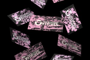
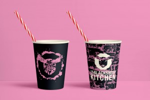
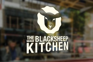
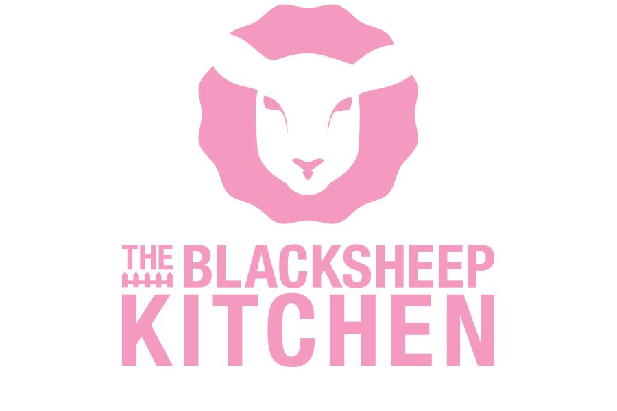
The wordmark plays on a modern sans-serif font, it’s about clean living and the homemade food you get at home if your mum was cooking for you. The second part of the logo is the icon which is a sheep head face on or also a wax seal of approval, it has a raw and craft element to the icon which juxtapositions with the clean cut font.
It’s alright to be yourself here, stand out and be different, being a social influencer and having your own style is celebrated. The place is a social hub that doesn’t take itself too seriously and you’re encouraged to leave your troubles at the door. Even if you’re just popping in for a cheeky drink you’re bound to see a friendly face.