Arm Yourself
TRIBAR isn’t just a place, a product or a fitness regime, it’s a mindset. It’s standing up and being counted, it's taking up arms in the war against an unhealthy lifestyle and fitness fads, it’s finding that soldier in us all and bringing it to the surface.
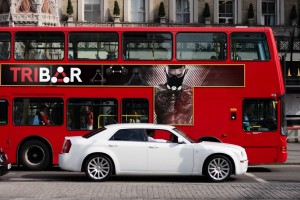
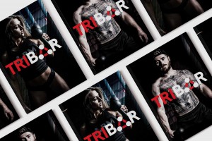
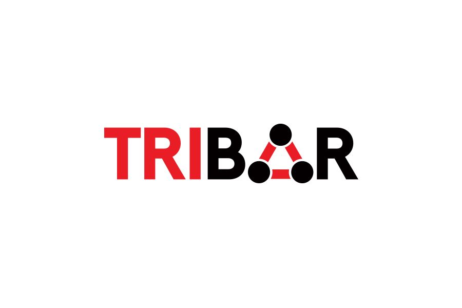
As soon as you first see the logo, you see the brand name immediately. TRIBAR. It’s right there, shouting at you, energetic and dynamic. It doesn’t hide behind anything - it’s proud of what it is, what it stands for, and what it delivers. The font is strong and bold, a classic no-nonsense Red and Black. There’s no messing around here. It’s forward facing, standing strong, robust and unshakeable, replicating the properties and traits of the TriBar product. The A of the logo is the graphical representation of TriBar's product, creating an instant familiarity, recognition, and trust with their customers when they unbox their product, built from the second they first laid eyes on the brand.
