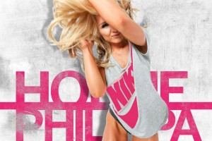


Uncompromisable - Indestructible - Fitness
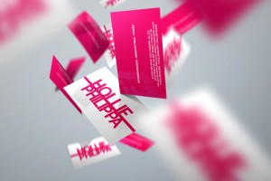
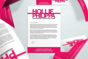
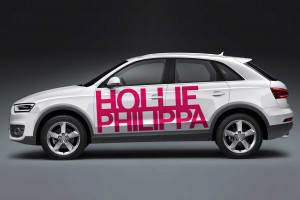
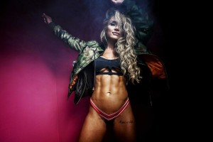
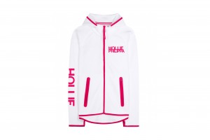
At first glance, you might be forgiven for thinking that the pink of the Hollie Philippa logo represents a girly girl and some gentle exercises. But look closer at the scaffolding used to construct the name; it’s built like a unit, and the pink merely indicates the mixture of blood, sweat and tears. The letters are interlocked to create a super solid structure. Strong and immovable, it’s what your body will be like after working out with Hollie! She’ll help put the pieces together onto a platform you can build on. Connected together, they evenly distribute whatever weight you put on it, so no matter what is thrown at your body - your fitness will remain indestructible. See when you get to understand you’re client to the degree that we do, the branding part comes naturally.