


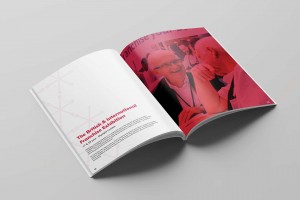
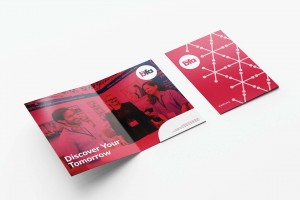
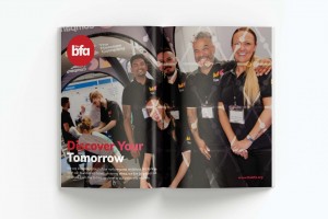

Discover Your Tomorrow
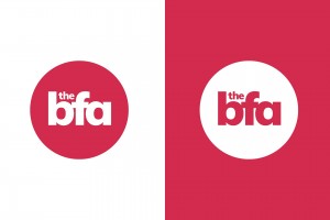
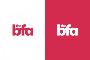
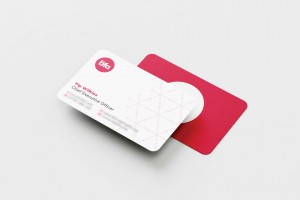
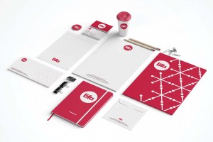
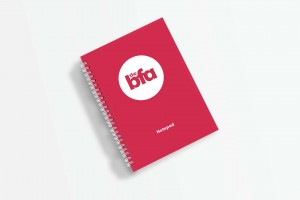
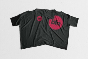
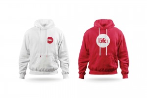
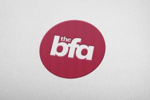
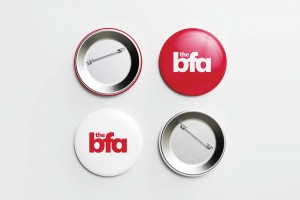
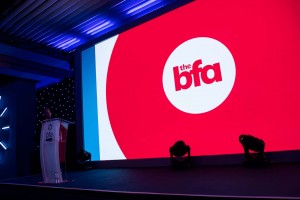
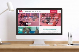
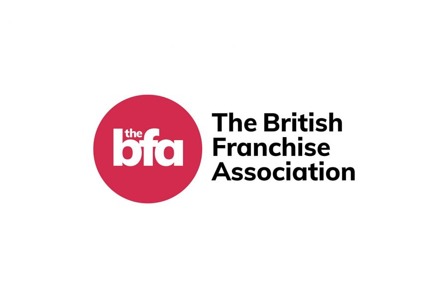
The BFA logo is bold yet friendly. Using a contemporary sans serif typeface refreshes the brand’s visual identity and readies it for the modern-day. Setting the text in lowercase communicates The BFA’s friendly, approachable and genuine qualities. Reducing the letter spacing brings the logo closer together as The BFA does with businesses up and down the UK. The ‘F’ almost has its ‘arms’ around the ‘b’ and ‘a’, a nice visual metaphor for how we look after our franchisees and franchisors. Encasing the text within a circle further intensifies the feeling of community surrounding the BFA and brings a certain timelessness to the logo. The warm, loving red indicates that you’ll most definitely be looked after when you enter their circle.