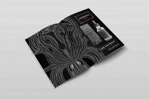

Tame the Beast
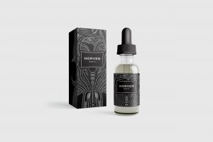
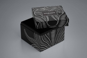
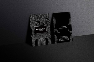
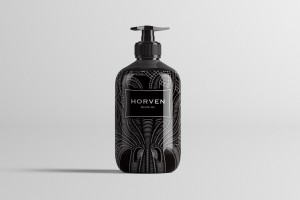
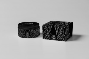
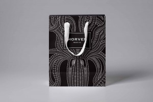
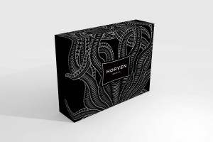
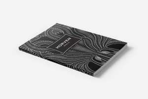
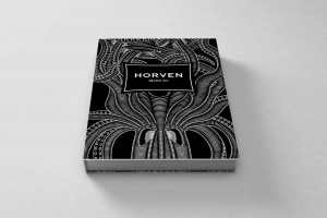
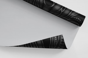
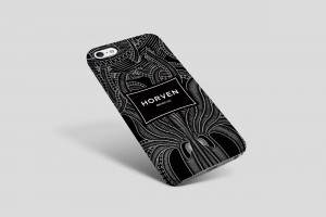
The centrepiece of the Horven brand is our bespoke illustrated interpretation of the mythical sea beast. We wanted to keep the illustrative style almost ancient as if our illustration had been drawn by a terrified bystander watching the Horven decimate a ship in front of their very eyes. Using thousands of individually crafted lines, we steadily built up the detailing of the Horven to the final product you see today, a juxtaposition of a modern digital illustration utilising an old school style.
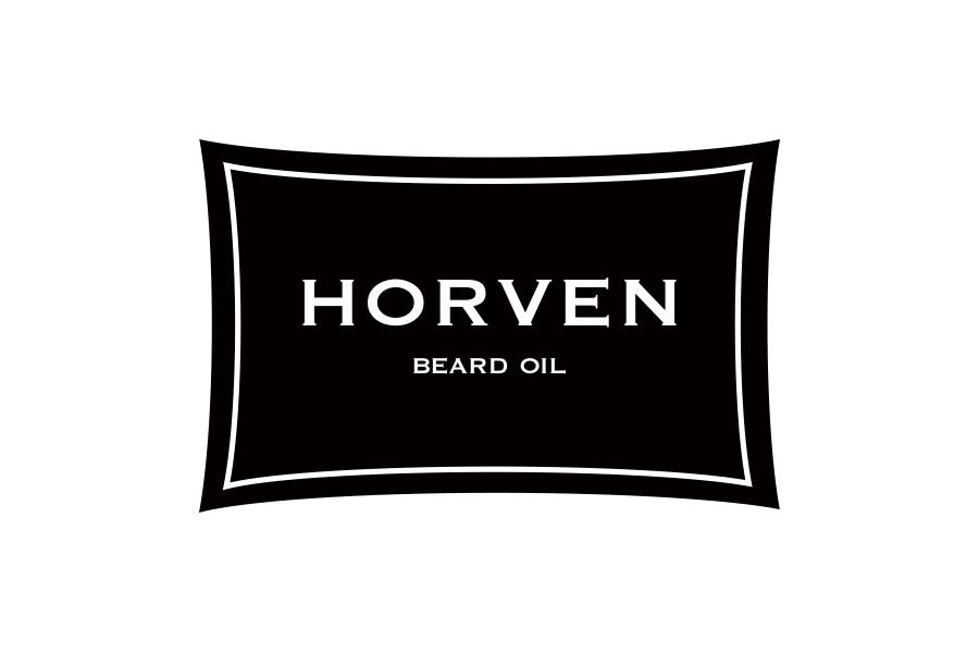
The Horven logo is clean, bold and simple. The logos text is set in the brand font Copperplate, a Victorian-inspired traditional font that has a nice modern day edge that brings a fashionable and contemporary feel to the logo. The text is contained inside a black carrier that has the edges arched ever so slightly, imitating the sails of a ship, pulling in the mythical aspect of the Horven sea creature and the ships it famously terrorised. A simple white line on the interior of the sail further emphasises the curves of the logo, enhancing the concept further.