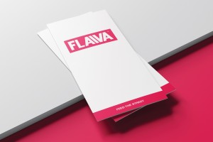
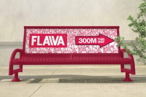
Feed The Street
Young, fresh and cool, Flaiva appeal to the millennials, young adults and professionals who want to experience something different when it comes to eating out, something completely unique when compared to the same old food chains you find on the high street. Flaiva wants everyone to taste their food, and they absolutely love making it, bouncing out of bed every morning to feed the Flaiva family.
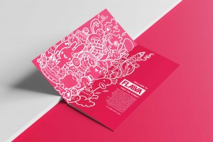
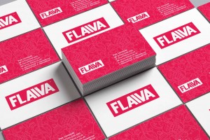
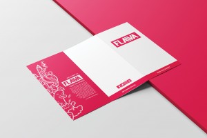
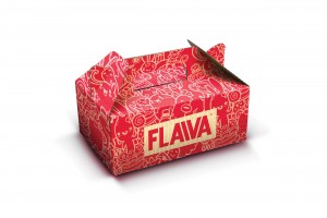
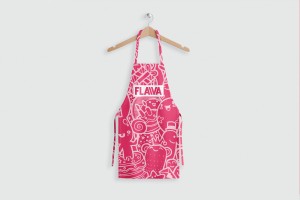
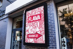
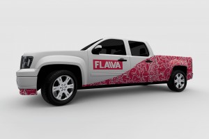
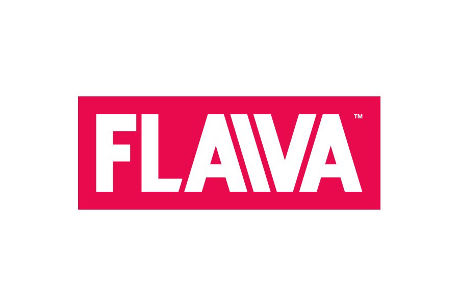
The clever twist on the spelling of ‘flavour’ perfectly reflects their unique take on the dishes the guys at Flaiva create. The logo itself is simple and straightforward. Flaiva is set in a solid and bold font, representing the brand's personality and outgoing essence. The font has been modified slightly so the letters sit closer together, reflecting the tight-knit nature and community that Flaiva have created. Sitting in a block of bright magenta, this further communicates Flaiva's energetic, entertaining and lively identity.